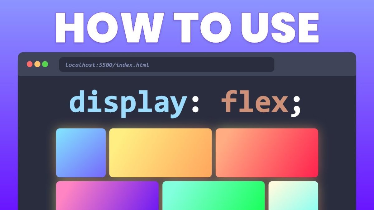
Discover the secrets of CSS Flexbox in our comprehensive guide. Learn how to create stunning, responsive web designs with ease and efficiency.
 The Aminul
Discover the secrets of CSS Flexbox in our comprehensive guide. Learn how to create stunning, responsive web designs with ease and efficiency.

In the ever-evolving world of web design, creating responsive layouts and typography is crucial to ensure that your websites look great on a wide range of devices and screen sizes. Fortunately, CSS has some powerful functions that make this task much easier: min(), max(), and clamp(). These CSS functions allow you to set minimum and […]