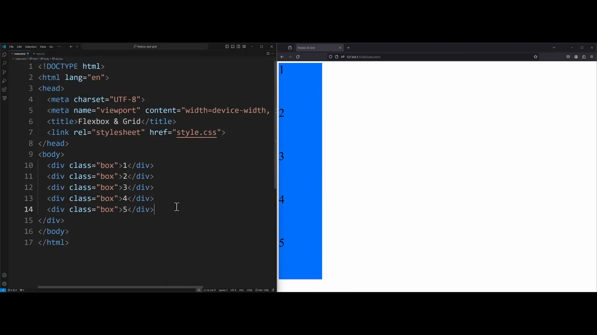
Have you ever struggled with overflowing elements or weird resizing behavior in CSS? Do you want to create stunning, responsive layouts with ease? If so, you’re in the right place! In this guide, we’ll dive deep into CSS Flexbox—a powerful layout model that can transform your web design experience.
What is Flexbox
CSS Flexbox, or the Flexible Box Layout, is a layout model that allows you to design complex layouts with a more efficient and predictable way of aligning elements. It fundamentally changes how we think about layouts in CSS. With Flexbox, you can easily control the alignment, direction, size, and order of elements, regardless of their size and content. This flexibility makes it a go-to choice for responsive designs.
How to Center a Div
One of the most common tasks in web design is centering elements. Flexbox simplifies this process significantly. To center a div, you start by applying display: flex; to the parent container. This changes the layout from block to flex, allowing items to sit side by side rather than stacking vertically.

Next, you can use the justify-content property to center items along the main axis and the align-items property to center them along the cross axis. Here’s an example:
body {
    display: flex;
    justify-content: center; /* Centers horizontally */
    align-items: center; /* Centers vertically */
    min-height: 800px; /* Set a height for visibility */
}This code will ensure that your elements are perfectly centered within the parent container.
Flex Direction
The flex-direction property is another crucial aspect of Flexbox. It defines the direction in which the flex items are placed in the flex container. The default value is row, which aligns items from left to right. However, you can change the direction to column, stacking items from top to bottom.
Additionally, you can use row-reverse or column-reverse to reverse the order of items. This flexibility allows you to create dynamic layouts easily.
Other Flexbox Properties
Flexbox comes with several properties that enhance layout control. These include:
- Flex Wrap: This property allows items to wrap onto multiple lines, creating a more responsive design. Use
flex-wrap: wrap;to enable wrapping. - Gap: The
gapproperty creates space between flex items without needing to use margins. For example,gap: 20px;adds 20 pixels of space between items.
FlexGrow
The flex-grow property allows a flex item to grow and fill available space in the container. By default, this value is 0, meaning the item will not grow. Setting it to 1 allows the item to take up any available space.
.box {
    flex-grow: 1; /* Item will grow to fill available space */
}You can also assign different grow values to different items, allowing for varied sizes within the same container.
Flex Shrink
In contrast, the flex-shrink property controls how an item shrinks to prevent overflow. By default, items will shrink to fit the container. You can set this property to 0 for specific items to prevent them from shrinking at all.
.box {
    flex-shrink: 0; /* Prevents this box from shrinking */
}
AlignSelf
The align-self property allows individual flex items to override the align-items setting of the container. This is useful when you want one item to behave differently than the others in the same flex container.
.box1 {
    align-self: flex-end; /* Aligns this specific box to the end */
}
Summary
Flexbox is a powerful layout tool that can help you create responsive designs with minimal effort. With properties like justify-content, align-items, flex-grow, and flex-wrap, you have the flexibility to control the layout of your elements precisely.
To recap:
- Use
display: flex;to enable flexbox on a container. - Center elements using
justify-contentandalign-items. - Control the direction of items with
flex-direction. - Manage spacing using
gap. - Make elements responsive with
flex-growandflex-shrink. - Customize individual item alignment with
align-self.
By mastering these Flexbox properties, you’ll be well-equipped to tackle any layout challenge that comes your way. For further learning, consider exploring CSS Grid, which offers another layer of flexibility for complex layouts.

