In the ever-evolving world of web design, creating responsive layouts and typography is crucial to ensure that your websites look great on a wide range of devices and screen sizes. Fortunately, CSS has some powerful functions that make this task much easier: min(), max(), and clamp().
These CSS functions allow you to set minimum and maximum values for various properties, giving you precise control over how your designs adapt to different viewing environments. In this article, we’ll explore how to use these functions effectively to create responsive designs that look fantastic on both small mobile screens and large desktop monitors.
The Power of CSS Functions
CSS functions provide a flexible way to define styles that adapt to different screen sizes. The min(), max(), and clamp() functions are particularly powerful because they allow us to set boundaries and constraints for various CSS properties. Let’s explore how to utilize these functions effectively.
Demystifying CSS min() Function: A Practical Guide
The min() function returns the smallest value among its arguments. It’s commonly used to set a minimum value for CSS properties. Let’s consider a practical example:
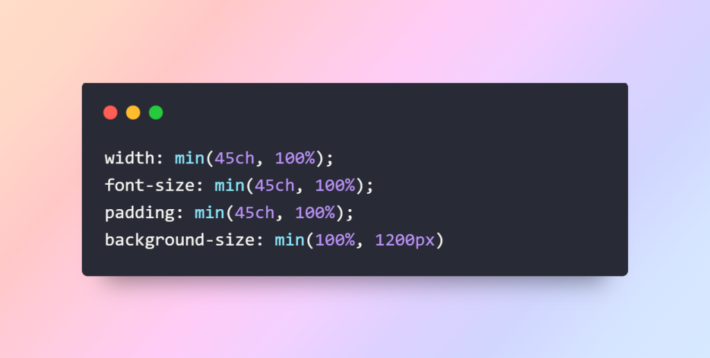
In this example, we’re using min() to set the width of an element. The element’s width will be at least 45ch (45 characters) but can expand to 100% if there’s more available space. This approach ensures that the content remains readable on narrow screens while taking full advantage of wider ones.
Harnessing the Power of CSS max() Function: A Practical Guide
Similar to min(), the max() function returns the largest value among its arguments. It’s employed to set a maximum value for CSS properties. Here’s an example:
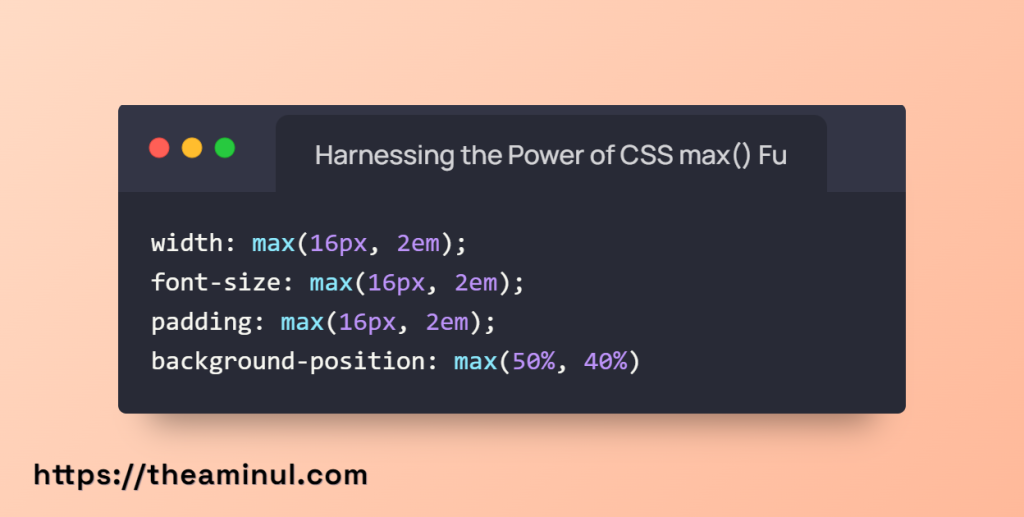
In this case, we’re using max() to determine the font size. The font size will be capped at 2em or 16px, whichever is smaller. This technique maintains readability while preventing text from becoming too large on larger screens.
Creating Responsive Designs with CSS clamp() Function: A Practical Guide
The clamp() function combines the best of both min() and max() functions, allowing you to set a value within a specified range. It takes three arguments: the minimum value, the preferred value, and the maximum value. Let’s look at an example:
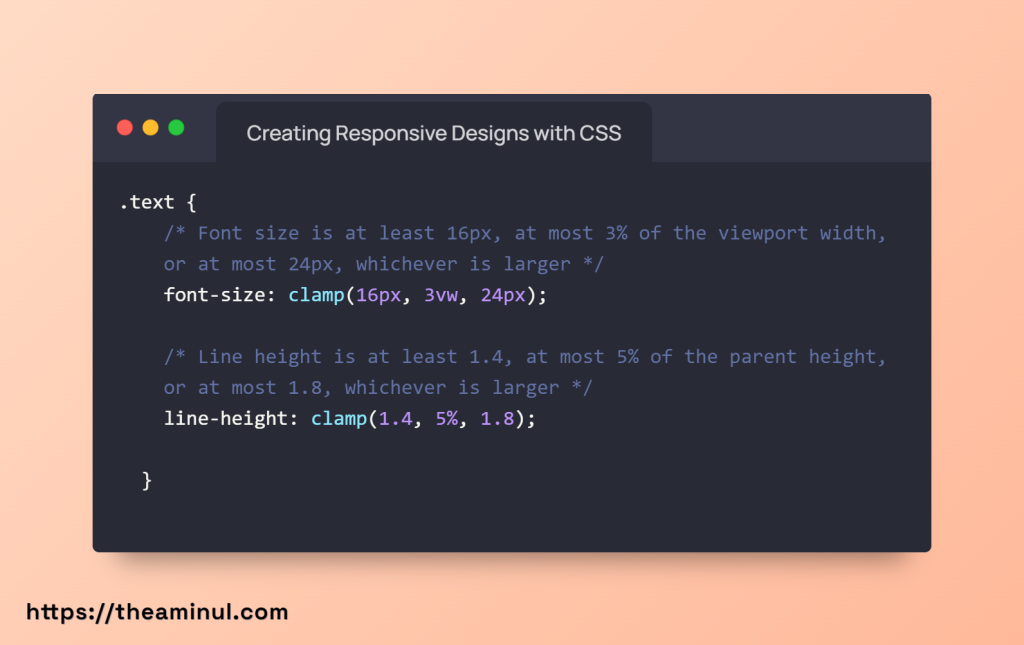
In this instance, we’re using clamp() to set the font size. The font size will be at least 16px, but it prefers to be 4vw (4% of the viewport width). However, it won’t exceed, ensuring that text remains legible without becoming too small or too large.
Perfecting Padding with clamp()
Padding is essential for creating well-organized content. To ensure consistent spacing on medium screens, the clamp() function comes to the rescue.
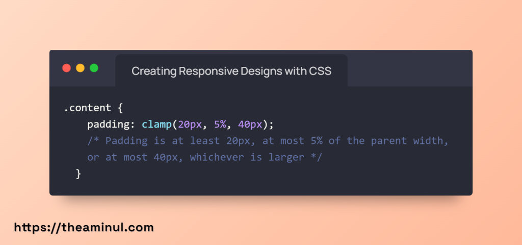
clamp() lets us maintain neat and visually appealing spacing, ensuring your content looks great on screens of all sizes.
Typography: An Art of Adaptation
Typography is more than just fonts; it’s about readability and aesthetics. clamp() can be employed for font sizes and line heights that gracefully adapt to varying screen sizes.

With this approach, text elements maintain readability and aesthetics across different devices.
Background Styling: Aesthetic Versatility
Background styling plays a significant role in the visual appeal of a website. Leveraging min() and max() functions for background sizing and positioning can enhance your site’s aesthetics.
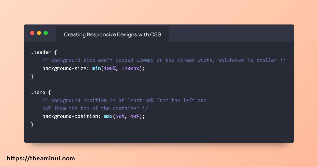
By doing so, you can ensure that background elements contribute to the overall visual experience on medium-sized screens.
Conclusion
CSS min(), max(), and clamp() functions are powerful tools in a web designer’s toolkit. They enable you to create responsive designs that gracefully adapt to various screen sizes and devices. Whether you’re designing layouts or fine-tuning typography, these functions offer precise control over your design’s behavior.
By incorporating these functions into your CSS stylesheets, you can ensure that your websites provide an optimal viewing experience for users on both mobile and desktop devices. So go ahead, experiment with min(), max(), and clamp(), and take your responsive web design skills to the next level. Your users will thank you for it.
Remember that responsive design is an ongoing process. Regular testing on various devices and screen sizes is crucial to ensure that your designs continue to provide a seamless user experience.
This comprehensive guide covers the fundamentals of CSS min(), max(), and clamp() functions for responsive web design. It explores various use cases and provides practical examples to help you master these techniques. Whether you’re a beginner or an experienced web designer, these functions can enhance your ability to create responsive and user-friendly websites.

